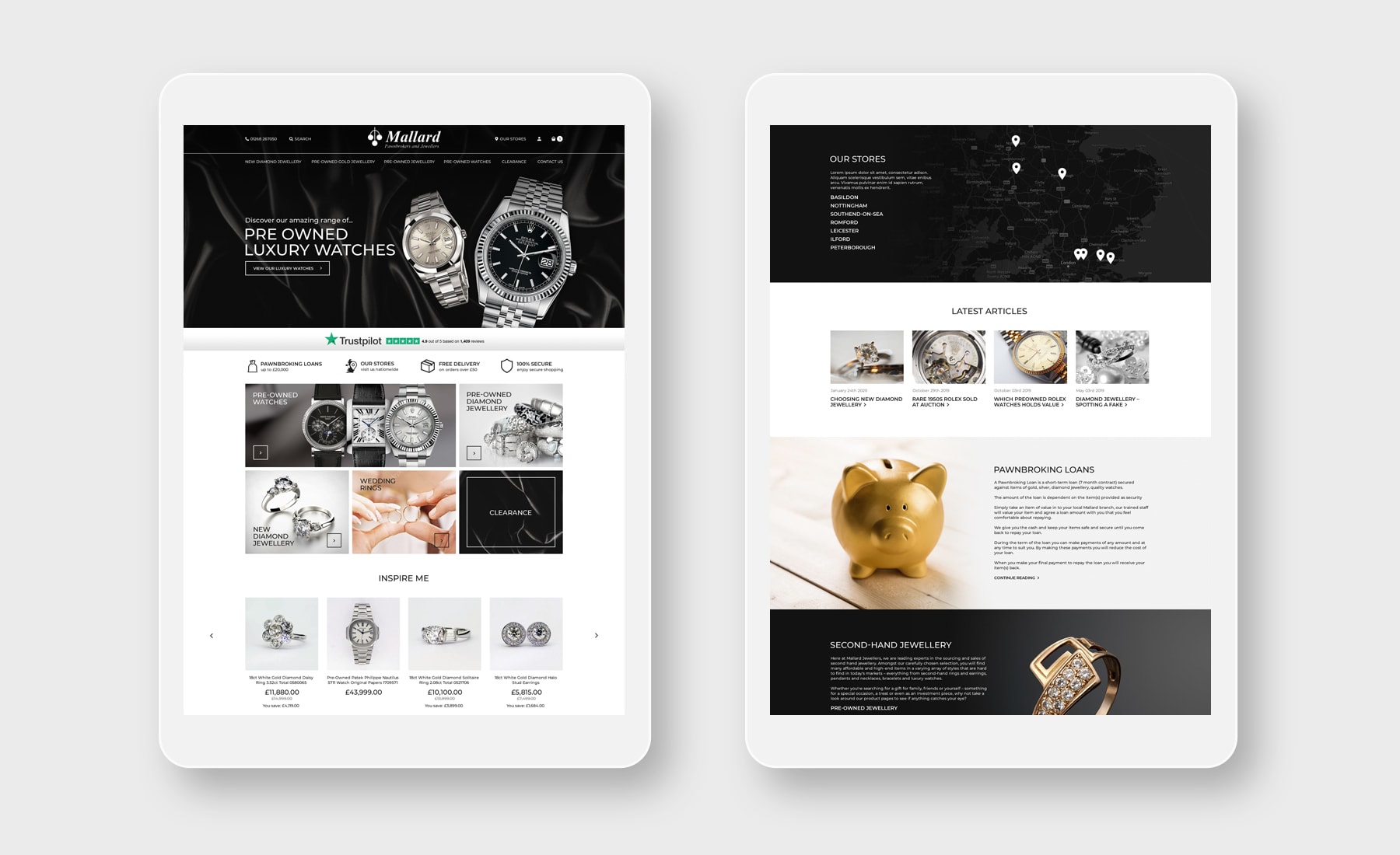
As more and more technology is made available, the ways in which customers are accessing stores and interacting with businesses is changing. Mobile and Tablet traffic is set to overtake that which originates from desktop in the near future, and ensuring that your business' online presence is suitable for every kind of device has never been more important.
A Responsive eCommerce Web Design could be the key to ensuring that your business is prepared for the upheaval of the coming years. If you are able to provide a stable, easily-accessible online presence for your customers, you are more likely to maintain their custom as the years progress!
Already, almost 40% of all traffic originates on a mobile device – can you afford to ignore almost half of your customer-base, simply because your website is not optimised for mobile platforms?
What Is Responsive Web Design?
Responsive web design is a style of website design which is becoming increasingly essential to any website. Responsive design creates desktop and mobile-friendly platforms and the website itself adapts to provide the optimum experience for the type of device that is used to access it.
Responsive software is essential in the creation of any new online presence, and there are three main tools which are used to optimise the experience for any device.

- Fluid Grids – This is a percentage-based system which aids with the basics of the web design itself.
- Flexible Media – This tool is responsible for scaling media element up or down, according to the size of the screen attached to the device.
- Media Queries – This tool is a piece of code which tells the browser which elements of the website need to be rearranged or modified to meet the device's criteria.
By utilising all three of these tools, our incredible developers can create a responsively designed eCommerce presence for your business. We can ensure that your website is as easy to interact with as possible, a factor which many customers consider to be the deciding factor between purchasing from a business.
The Bountiful Benefits Of Responsive eCommerce Web Design!
The benefits of a mobile-friendly online presence are endless, and these types of website will soon become a necessity for any business which relies on its online presence for its sustainability.
- One Site Fits All! – As our responsive software only requires one set of URLs and HTML code, responsive design runs from a single CMS. Not only will this work to simplify your website's maintenance costs, but it also ensures that all of your customers can access your site's latest content on any device they choose! An often overlooked component of a responsively designed website is the benefits it provides for search engine optimisation purposes. The single set of URLs is great for SEO as every link is directed towards a single domain. Most search engines love responsively designed eCommerce sites, and often favour these types of website in the search engine results pages.
- Improved User Experience! – Every piece of content will adapt to the device's screen size. This can be hugely important to a customer's enjoyment of the site, particularly with regards to the sizes of links or buttons on the webpage. Altering the layout is an important aspect too, as it ensures that your viewer will receive only the information that they need on a mobile device, when they are more likely to be in a hurry.
- Increased Conversion Rate – More than a third of all mobile shoppers abandon a transaction, if the site in question is not optimised for their device. Ensuring that your site is mobile-friendly is important to encouraging a high conversion rate.
Choose Advansys – The Responsive eCommerce Experts!
The philosophy behind responsive web design does not just end at a mobile-friendly site. It results in a site which is entirely optimised for extreme functionality. Suitable for desktops, touch-screens and mobile phones, the very best responsive web designs work to create a simple and enjoyable experience for the customer. They work to make navigation and decision-making all the easier, and encourage a high level of interactivity.
The simple, toned-down design of responsive web sites also encourages slimmed down content, meaning that your website will become more effective at transferring information, without requiring massive amounts of on-page space to do so.
Here at Advansys, we specialise in creating responsive eCommerce web design from scratch. Our method ensures that your website will be wholly unique to your business, and match your brand's ethos and personality perfectly. Our responsive solution is designed using Bootstrap technology, originally designed by Twitter, which makes our websites amongst the fastest mobile solutions in the world!
For more information, you should check out our blogs, some of our amazing customer testimonials, or email to sales@advansys.gi, and we will answer them as soon as we can!